To facilitate the creation of the CheckBoxes, Android provides the android.widget.CheckBox class. Instead of using the default settings, we can also customize the UI of view elements in Android. Thus, different images of the checkbox can also be added to the layout. The CheckBox in Android can be understood as a type of two-state button. Here, the two-state means that it can be either checked or unchecked. Checkboxes can be used to serve various purposes such as selecting the hobbies of a user and to activate/deactivate a specific action. The CompoundButton class in Android has a subclass named CheckBox class.
Example of Custom CheckBox:
activity_main.xml: (File: activity_main.xml)
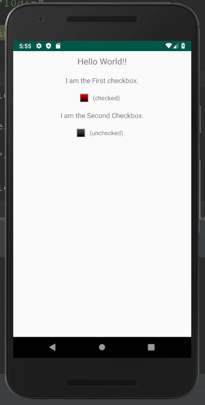
<?xml version="1.0" encoding="utf-8"?> <LinearLayout xmlns:android="http://schemas.android.com/apk/res/android" android:layout_width="fill_parent" android:layout_height="fill_parent" android:orientation="vertical" > <TextView android:layout_width="fill_parent" android:layout_height="wrap_content" android:textSize="20dip" android:gravity="center" android:padding="10dip" android:text="Hello World!!" /> <TextView android:layout_width="fill_parent" android:layout_height="wrap_content" android:textSize="16dip" android:gravity="center" android:padding="10dip" android:text="I am the First checkbox." /> <LinearLayout android:layout_width="fill_parent" android:layout_height="wrap_content" android:gravity="center" android:orientation="horizontal"> <CheckBox android:id="@+id/checkbox1" android:layout_width="wrap_content" android:layout_height="wrap_content" android:layout_gravity="center" android:button="@xml/custom_checkbox"/> <TextView android:id="@+id/textview1" android:layout_width="wrap_content" android:layout_height="wrap_content" android:textSize="14dip" android:gravity="center" android:padding="10dip" android:text="(unchecked)" /> </LinearLayout> <TextView android:layout_width="fill_parent" android:layout_height="wrap_content" android:textSize="16dip" android:gravity="center" android:padding="10dip" android:text="I am the Second Checkbox." /> <LinearLayout android:layout_width="fill_parent" android:layout_height="wrap_content" android:gravity="center" android:orientation="horizontal"> <CheckBox android:id="@+id/checkbox2" android:layout_width="wrap_content" android:layout_height="wrap_content" android:layout_gravity="center" android:button="@xml/custom_checkbox"/> <TextView android:id="@+id/textview2" android:layout_width="wrap_content" android:layout_height="wrap_content" android:textSize="14dip" android:gravity="center" android:padding="10dip" android:text="(unchecked)" /> </LinearLayout> </LinearLayout> |
checked.xml:
<?xml version="1.0" encoding="utf-8"?> <shape xmlns:android="http://schemas.android.com/apk/res/android" android:shape="rectangle"> <gradient android:startColor="#ffff0000" android:endColor="#ff000000" android:angle="270"/> <stroke android:width="4px" android:color="#ffc0c0c0" /> <size android:height="20dp" android:width="20dp"/> </shape> |
unchecked.xml:
<?xml version="1.0" encoding="utf-8"?> <shape xmlns:android="http://schemas.android.com/apk/res/android" android:shape="rectangle"> <gradient android:startColor="#ff585858" android:endColor="#ff000000" android:angle="270"/> <stroke android:width="4px" android:color="#ffc0c0c0" /> <size android:height="20dp" android:width="20dp"/> </shape> |
custom_checkbox.xml: (File: custom_checkbox.xml)
To customize the checkbox we will implement a selector in the checkbox.xml file under the drawable folder.
<?xml version="1.0" encoding="utf-8"?> <selector xmlns:android="http://schemas.android.com/apk/res/android"> <item android:state_checked="true" android:drawable="@xml/checked" /> <item android:state_pressed="true" android:drawable="@xml/checked" /> <item android:drawable="@xml/unchecked" /> </selector> |
Activity class: (File: MainActivity.java)
package com.example.radioapp; import android.app.Activity; import android.os.Bundle; import android.view.View; import android.view.View.OnClickListener; import android.widget.CheckBox; import android.widget.TextView; public class MainActivity extends Activity implements OnClickListener { /** Called when the activity is first created. */ @Override public void onCreate(Bundle savedInstanceState) { super.onCreate(savedInstanceState); setContentView(R.layout.activity_main); findViewById(R.id.checkbox1).setOnClickListener(this); findViewById(R.id.checkbox2).setOnClickListener(this); } @Override public void onClick(View v) { TextView tv; if (v.getId()==R.id.checkbox1) { tv = (TextView)findViewById(R.id.textview1); } else { tv = (TextView)findViewById(R.id.textview2); } if (((CheckBox)v).isChecked()) { tv.setText("(checked)"); } else { tv.setText("(unchecked)"); } } } |
Output 1:
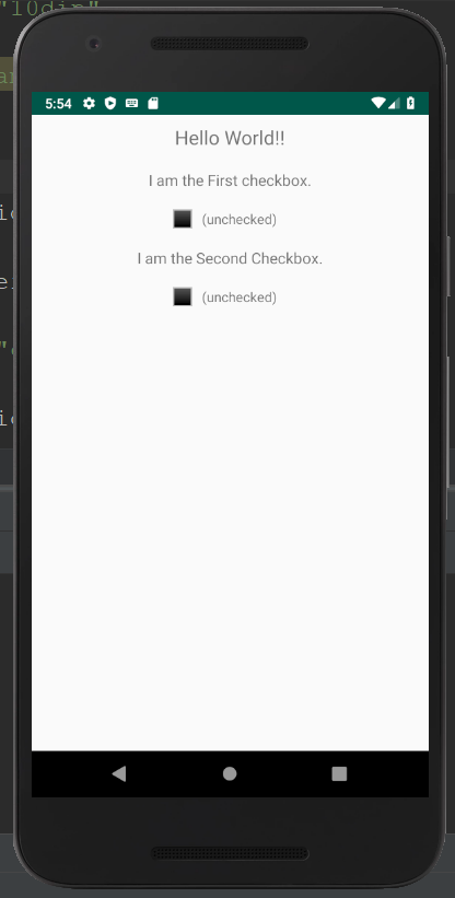
Output 2: