The feature to enter dates easily and visually is facilitated by the jQuery UI Datepicker widget. It also supports the feature to customize the date format and language, restrict the selectable date ranges, adds buttons and other navigation options easily. Along with creating a date picker, the jQuery UI Datepicker() method also changes the appearance of the HTML element on the pages by adding new CSS classes.
Syntax:
The datepicker() method can be used in two forms:
$(selector, context).datepicker (options) Method
OR
$(selector, context).datepicker (“action”, [params]) Method
First Method:
To specify that an <input>, <div>, or <span> element (depending on the way to display the calendar) should be managed as a date picker, the Datepicker (options) method is used. The behavior and appearance of the date picker elements are specified by the options parameter.
Syntax:
$(selector, context).datepicker(options);
Multiple options can also at a time using a JavaScript object. The options need to be separated using a comma for this.
Syntax:
$(selector, context).datepicker({option1: value1, option2: value2..... });
The various options that can be used with this method are listed below:
| Option | Uses |
| altField | To define a jQuery selector for a field that is also updated with any date selections. To set the format for this value, the altFormat option is used. It is usually used for setting date values into a hidden input element to be submitted to the server, while displaying a more user-friendly format to the user. The default value is “”. |
| altFormat | To facilitate the format for the value to be written to the alternate element. Used when an altField option is specified. The default value is “”. |
| appendText | To be placed after the <input> element, intended to show instructions to the user. It is a string value. The default value is “”. |
| autoSize | To resize the <input> element to accommodate the datepicker’s date format as set with the date format option, when set to true. The default value is false. |
| beforeShow | It is a callback function. It is invoked just before a datepicker is displayed, with the <input> element and datepicker instance passed as parameters. It can return an options hash used to modify the datepicker. The default value is “”. |
| beforeShowDay | To take a date value as parameter, which is invoked for each day in the datepicker just before it is displayed, with the date passed as the only parameter. It is also used to override some of the default behavior of the day elements. It is a callback function that must return a three-element array. The default value is null. |
| buttonImage | To define the path to an image to be displayed on the button enabled by setting the showOn option to one of buttons or both. The button text becomes the alt attribute of the button, when the buttonText is also present. The default value is “”. |
| buttonImageOnly | To indicate that the image specified by buttonImage is to appear standalone (not on a button), when set to true. It is also important that the showOn option is still being set to one of buttons or both for the image to appear. The default value is false. |
| buttonText | To define a caption for the button enabled by setting the showOn option to one of buttons or both. The default value is “…”. |
| calculateWeek | To calculate and return the week number for a date passed as the lone parameter. It is a custom function. The default value is provided by the $.datepicker.iso8601week() utility function. |
| changeMonth | To display a month dropdown, allowing the user to directly change the month without using the arrow buttons to step through them, when set to true. The default value is false. |
| changeYear | To display a year dropdown, allowing the user to directly change the year without using the arrow buttons to step through them, when set to true. To control the years made available for selection, the option yearRange can be used. The default value is false. |
| closeText | To define the text to replace the default caption of done for the close button, when the button panel is displayed via the showbuttonpanel option. The default value is “done”. |
| constrainInput | To text entry into the <input> element is constrained to characters allowed by the current Dateformat option, when set to true (the default). The default value is true. |
| currentText | To define the text to replace the default caption of today for the current button, when the button panel is displayed via the showButtonPanel option. The default value is today. |
| dateFormat | To define the date format to be used. The default value is mm/dd/yy. |
| dayNames | To provide the full day names with the 0th element representing Sunday. It localizes the control. It is a 7-element array. The default value is [ “Sunday”, “Monday”, “Tuesday”, “Wednesday”, “Thursday”, “Friday”, “Saturday” ]. |
| dayNamesMin | To provide the minimal day names with the 0th element representing Sunday, used as column headers. It is a 7-element array. It localizes the control. The default value is [ “Su”, “Mo”, “Tu”, “We”, “Th”, “Fr”, “Sa” ]. |
| dayNamesShort | To provide the short day names with the 0th element representing Sunday. It is a 7-element array. It localizes the control. The default value is [ “Sun”, “Mon”, “Tue”, “Wed”, “Thu”, “Fri”, “Sat” ]. |
| defaultDate | To set the initial date for the control, overriding the default value of today, when the <input> element has no value. Its value can be a date instance, the number of days from today, or a string specifying an absolute or relative date. The default value is null. |
| duration | To define the speed of the animation that makes the datepicker appear. It can take values from either slow, normal, or fast, or the number of milliseconds for the animation to span. The default value is normal. |
| firstday | To define which day is considered the first day of the week, and will be displayed as the left-most column. The default value is 0. |
| gotocurrent | To set the current day link to the selected date, overriding the default of today, when set to true. The default value is false. |
| hideIfNoPrevNext | To hide the next and previous links (as opposed to merely disabling them) when they aren’t applicable, as determined by the settings of the mindate and maxdate options, when set to true. The default value is false. |
| isRTL | To define the localizations as a right-to-left language, when set to true. The default value is false. |
| maxDate | To set the maximum selectable date for the control. Its value can be a date instance, the number of days from today, or a string specifying an absolute or relative date. The default value is null. |
| minDate | To set the minimum selectable date for the control. Its value can be a date instance, the number of days from today, or a string specifying an absolute or relative date. The default value is null. |
| monthnames | To provide the full month names with the 0th element representing January. It is a 12-element array. It localizes the control. The default value is [ “January”, “February”, “March”, “April”, “May”, “June”, “July”, “August”, “September”, “October”, “November”, “December” ]. |
| monthNamesShort | To provide the short month names with the 0th element representing January. It is a 12-element array. It localizes the control. The default value is [ “Jan”, “Feb”, “Mar”, “Apr”, “May”, “Jun”, “Jul”, “Aug”, “Sep”, “Oct”, “Nov”, “Dec” ]. |
| navigationAsDateFormat | To pass the navigation links for nexttext, prevtext, and currenttext through the $.datepicker.formatdate() function prior to display, when set to true. The date formats are thus allowed to be supplied for those options that get replaced with the relevant values. The default value is false. |
| nexttext | To define the text to replace the default caption of next for the next month navigation link. This text is replaced with an icon by the themeRoller. The default value is next. |
| numberOfMonths | To define the number of months to show in the datepicker. The default value is 1. |
| onChangeMonthYear | To be invoked when the datepicker moves to a new month or year, with the selected year, month (1-based), and datepicker instance passed as parameters, and the function context is set to the input field element. It is a callback. The default value is null. |
| onClose | To be invoked whenever a datepicker is closed, passed the selected date as text (the empty string if there is no selection), and the datepicker instance, and the function context is set to the input field element. It is a callback. The default value is null. |
| onSelect | To be invoked whenever a date is selected, passed the selected date as text (the empty string if there is no selection), and the datepicker instance, and the function context is set to the input field element. It is a callback. The default value is null. |
| prevText | To define the text to replace the default caption of prev for the previous month navigation link. This text is replaced with an icon by the themeRoller. The default value is PrevdefaultDatedayNamesMin. |
| selectOtherMonths | To make the days shown before or after the displayed month(s) are selectable, when set to true. For the days to be displayed, the showOtherMonths option needs to be true. The default value is false. |
| shortYearCutoff | To define a value between 0 and 99 years before which any 2-digit year values will be considered to belong to the previous century, when the option is a number. The value undergoes a numeric conversion and is added to the current year, when it is a string. The default value is +10 which represents 10 years from the current year. |
| showAnim | To set the name of the animation to be used to show and hide the datepicker. Its value must be one of the “show” (the default), fadein, slidedown, or any of the jquery ui show/hide animations, if specified. The default value is “show”. |
| showButtonPanel | To display a button panel at the bottom of the datepicker, containing current and close buttons, when set to true. the currentText and closeText options can provide the caption of these buttons. The default value is false. |
| showCurrentAtPos | To define the 0-based index, starting at the upper left, of where the month containing the current date should be placed within a multi-month display. The default value is 0. |
| showMonthAfterYear | To define the positions of the month and year are reversed in the header of the datepicker, when set to true. The default value is false. |
| showOn | To indicate when the datepicker should appear. It can take either of the values: focus, button or both. The default value is focus. |
| showOptions | To provide a hash to be passed to the animation when a jQuery UI animation is specified for the showAnim option. The default value is {}. |
| showOtherMonths | To display the dates before or after the first and last days of the current month, when set to true. These dates becomes selectable only when the selectOtherMonths option is also set to true. The default value is false. |
| showWeek | To display the week number in a column to the left of the month display, when set to true. To alter the manner in which this value is determined, the calculateWeek option can be used. The default value is false. |
| stepMonths | To indicate the number of months to move when one of the month navigation controls is clicked. The default value is 1. |
| weekHeader | To define the text to display for the week number column, overriding the default value of wk, when showWeek is true. The default value is wk. |
| yearRange | To define the limits on which years are displayed in the dropdown in the form: when changeYear is true. It can take value as absolute or relative (for example: 2005:+2, for 2005 through 2 years from now). To make relative values offset from the selected year rather than the current year, the prefix c can be used (example: c-2:c+3). The default value is c-10:c+10. |
| yearSuffix | To display the additional text after the year in the datepicker header. The default value is “”. |
Example 1:
jQuery UI Datepicker functionality
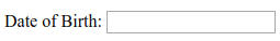
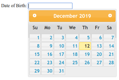
Date of Birth:
Output 1:
Output 2:
Explanation:
In the above example, we are displaying the Datepicker functionality. Here, we are passing no parameter to the Datepicker() method.
Example 2:
jQuery UI Datepicker functionality
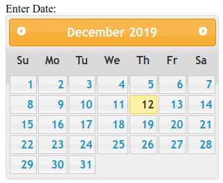
Enter Date:
Output:
Explanation:
In the above example, we are displaying the use and the behavior of the inline Datepicker.
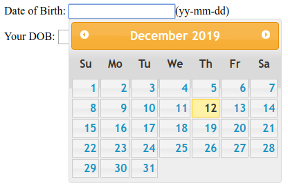
Example 3:
jQuery UI Datepicker functionality
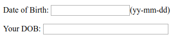
Date of Birth:
Your DOB:
Output 1:
Output 2:
Output 3:
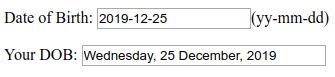
Explanation:
In the above example, we are displaying the use and the behavior of the options, appendText, dateFormat, altField and altFormat in the jQueryUI Datepicker() method. Here, we are displaying an alternative field with the alternative format for the selected date.
Example 4:
jQuery UI Datepicker functionality
Date of Birth:
Output 1:
Output 2:
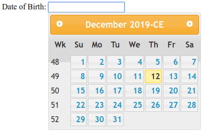
Explanation:
In the above example, we are displaying the use and the behavior of the showWeek, yearSuffix and showAnim in the Datepicker() function of jQueryUI.
Second Method:
To act as the calendar, the Datepicker (action, params) method is used. It is used to perform actions such as selecting a new date. The action is the first argument and is specified as a string. One or multiple params can also be used according to the action if required.
Syntax:
$(selector, context).datepicker ("action", [params]);
The various actions that can be used with this method are listed below:
| Action | Uses |
| destroy() | To eliminate the datepicker functionality completely to return the element back to its pre-init state. No argument is accepted by this method. |
| dialog( Date [, onSelect ] [, settings ] [, Pos ] ) | To display the datepicker in a jQuery ui dialog box . |
| getDate() | To get the date corresponding to the selected date. No argument is accepted by this method. |
| hide() | To close the previously opened date picker. No argument is accepted by this method. |
| isDisabled() | To determine if the date picker functionality is disabled. No argument is accepted by this method. |
| option(optionName) | To get the value currently associated with the specified optionName. |
| option() | To retrieve an object containing key/value pairs representing the current datepicker options hash. No argument is accepted by this method. |
| option(optionName, Value) | To set the value of the datepicker option associated with the specified optionName. |
| option(Options) | To set one or more options for the datepicker. |
| refresh() | To redraw the date picker, after having made some external modifications. No argument is accepted by this method. |
| setdate(date) | To set the specified date as the current date of the datepicker. |
| show() | To open the date picker. The input must be visible for the datepicker to be shown, when the datepicker is attached to an input. No argument is accepted by this method. |
| widget() | To get a jQuery object containing the datepicker. |
Example 5:
jQuery UI Datepicker functionality
Date:
Output:
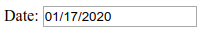
Explanation:
In the above example, we are displaying the use and the behavior of the setDate() action. Here, the date displayed in the result is the date after five weeks plus one day from the current date.