Alert refers to a state of being watchful.
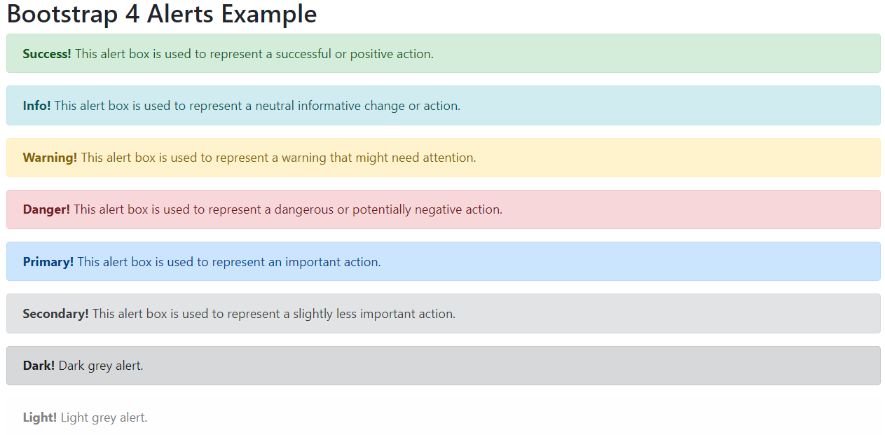
Bootstrap 4 provides the .alert class to provide an easy way to create predefined alert messages. The .alert class will be followed by one of the four contextual classes .alert-success, .alert-info, .alert-warning,.alert-danger, .alert-primary, .alert-secondary, .alert-light or .alert-dark.
Bootstrap 4 Alert Example:
<!DOCTYPE html> <html lang="en"> <head> <title>Bootstrap 4 Alerts Example</title> <meta charset="utf-8"> <meta name="viewport" content="width=device-width, initial-scale=1"> <link rel="stylesheet" href="https://maxcdn.bootstrapcdn.com/bootstrap/4.0.0/css/bootstrap.min.css"> <script src="https://ajax.googleapis.com/ajax/libs/jquery/3.3.1/jquery.min.js"></script> <script src="https://cdnjs.cloudflare.com/ajax/libs/popper.js/1.12.9/umd/popper.min.js"></script> <script src="https://maxcdn.bootstrapcdn.com/bootstrap/4.0.0/js/bootstrap.min.js"></script> </head> <body> <div class="container"> <h2>Bootstrap 4 Alerts Example</h2> <div class="alert alert-success"> <strong>Success!</strong> This alert box is used to represent a successful or positive action. </div> <div class="alert alert-info"> <strong>Info!</strong> This alert box is used to represent a neutral informative change or action. </div> <div class="alert alert-warning"> <strong>Warning!</strong> This alert box is used to represent a warning that might need attention. </div> <div class="alert alert-danger"> <strong>Danger!</strong> This alert box is used to represent a dangerous or potentially negative action. </div> <div class="alert alert-primary"> <strong>Primary!</strong> This alert box is used to represent an important action. </div> <div class="alert alert-secondary"> <strong>Secondary!</strong> This alert box is used to represent a slightly less important action. </div> <div class="alert alert-dark"> <strong>Dark!</strong> Dark grey alert. </div> <div class="alert alert-light"> <strong>Light!</strong> Light grey alert. </div> </div> </body> </html> |
Output:
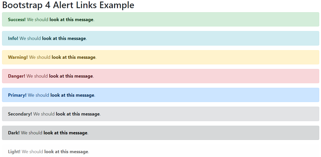
Bootstrap 4 Alert Link
We have to add the alert-link class to any links inside the alert box to create “matching colored links”.
Bootstrap 4 Alert Link Example:
<!DOCTYPE html> <html lang="en"> <head> <title>Bootstrap 4 Alert Links Example</title> <meta charset="utf-8"> <meta name="viewport" content="width=device-width, initial-scale=1"> <link rel="stylesheet" href="https://maxcdn.bootstrapcdn.com/bootstrap/4.0.0/css/bootstrap.min.css"> <script src="https://ajax.googleapis.com/ajax/libs/jquery/3.3.1/jquery.min.js"></script> <script src="https://cdnjs.cloudflare.com/ajax/libs/popper.js/1.12.9/umd/popper.min.js"></script> <script src="https://maxcdn.bootstrapcdn.com/bootstrap/4.0.0/js/bootstrap.min.js"></script> </head> <body> <div class="container"> <h2>Bootstrap 4 Alert Links Example</h2> <div class="alert alert-success"> <strong>Success!</strong> We should <a href="#" class="alert-link">look at this message</a>. </div> <div class="alert alert-info"> <strong>Info!</strong> We should <a href="#" class="alert-link">look at this message</a>. </div> <div class="alert alert-warning"> <strong>Warning!</strong> We should <a href="#" class="alert-link">look at this message</a>. </div> <div class="alert alert-danger"> <strong>Danger!</strong> We should <a href="#" class="alert-link">look at this message</a>. </div> <div class="alert alert-primary"> <strong>Primary!</strong> We should <a href="#" class="alert-link">look at this message</a>. </div> <div class="alert alert-secondary"> <strong>Secondary!</strong> We should <a href="#" class="alert-link">look at this message</a>. </div> <div class="alert alert-dark"> <strong>Dark!</strong> We should <a href="#" class="alert-link">look at this message</a>. </div> <div class="alert alert-light"> <strong>Light!</strong> We should <a href="#" class="alert-link">look at this message</a>. </div> </div> </body> </html> |
Output:
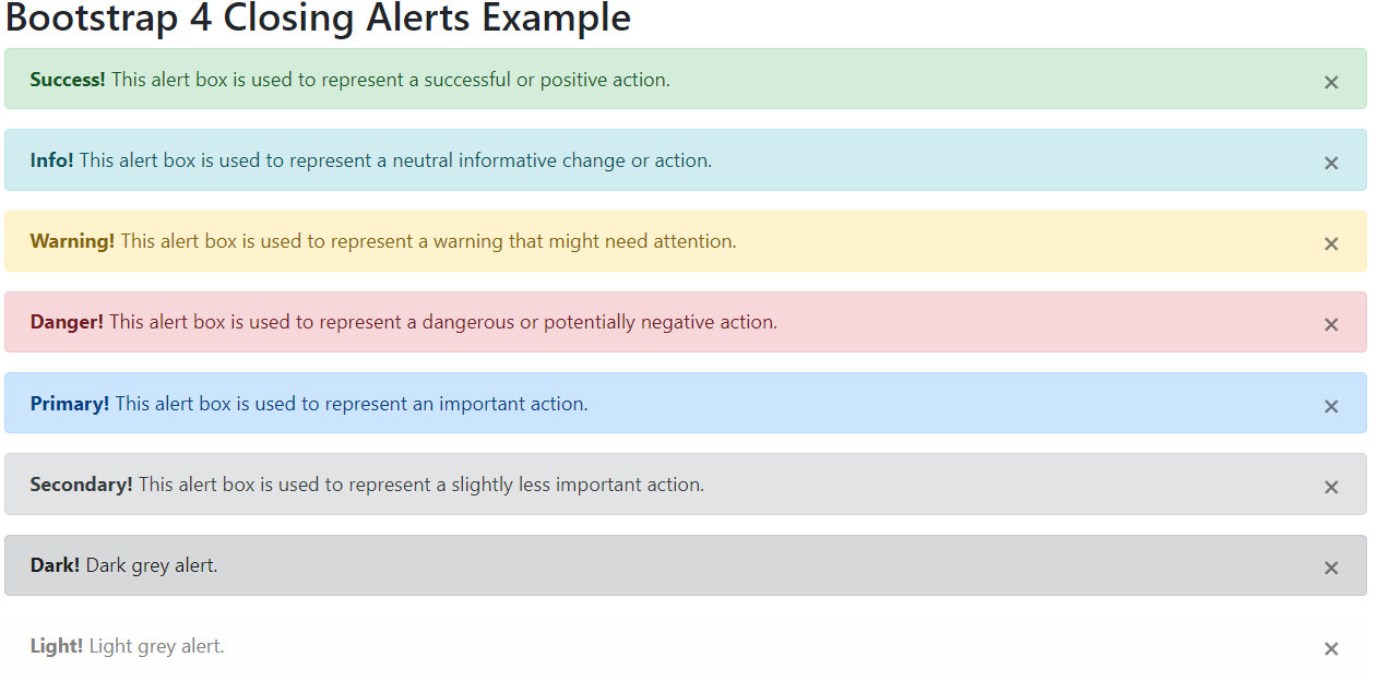
Bootstrap 4 Closing Alerts
To close the alert message we have to add an .alert-dismissable class to the alert container. Then add class=”close” and data-dismiss=”alert” to a link or a button element. When you click on the close sign, the alert box will be closed.
Bootstrap 4 Closing Alerts Example:
<!DOCTYPE html> <html lang="en"> <head> <title>Bootstrap 4 Closing Alerts Example</title> <meta charset="utf-8"> <meta name="viewport" content="width=device-width, initial-scale=1"> <link rel="stylesheet" href="https://maxcdn.bootstrapcdn.com/bootstrap/4.0.0/css/bootstrap.min.css"> <script src="https://ajax.googleapis.com/ajax/libs/jquery/3.3.1/jquery.min.js"></script> <script src="https://cdnjs.cloudflare.com/ajax/libs/popper.js/1.12.9/umd/popper.min.js"></script> <script src="https://maxcdn.bootstrapcdn.com/bootstrap/4.0.0/js/bootstrap.min.js"></script> </head> <body> <div class="container"> <h2>Bootstrap 4 Closing Alerts Example</h2> <div class="alert alert-success alert-dismissable"> <button type="button" class="close" data-dismiss="alert">×</button> <strong>Success!</strong> This alert box is used to represent a successful or positive action. </div> <div class="alert alert-info alert-dismissable"> <button type="button" class="close" data-dismiss="alert">×</button> <strong>Info!</strong> This alert box is used to represent a neutral informative change or action. </div> <div class="alert alert-warning alert-dismissable"> <button type="button" class="close" data-dismiss="alert">×</button> <strong>Warning!</strong> This alert box is used to represent a warning that might need attention. </div> <div class="alert alert-danger alert-dismissable"> <button type="button" class="close" data-dismiss="alert">×</button> <strong>Danger!</strong> This alert box is used to represent a dangerous or potentially negative action. </div> <div class="alert alert-primary alert-dismissable"> <button type="button" class="close" data-dismiss="alert">×</button> <strong>Primary!</strong> This alert box is used to represent an important action. </div> <div class="alert alert-secondary alert-dismissable"> <button type="button" class="close" data-dismiss="alert">×</button> <strong>Secondary!</strong> This alert box is used to represent a slightly less important action. </div> <div class="alert alert-dark alert-dismissable"> <button type="button" class="close" data-dismiss="alert">×</button> <strong>Dark!</strong> Dark grey alert. </div> <div class="alert alert-light alert-dismissable"> <button type="button" class="close" data-dismiss="alert">×</button> <strong>Light!</strong> Light grey alert. </div> </div> </body> </html> |
Output:
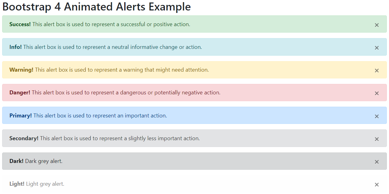
Bootstrap provides the .fade and .in classes to add a fading effect when closing the alert message.
Bootstrap 4 Animated Alerts Example:
<!DOCTYPE html> <html lang="en"> <head> <title>Bootstrap 4 Animated Alerts Example</title> <meta charset="utf-8"> <meta name="viewport" content="width=device-width, initial-scale=1"> <link rel="stylesheet" href="https://maxcdn.bootstrapcdn.com/bootstrap/4.0.0/css/bootstrap.min.css"> <script src="https://ajax.googleapis.com/ajax/libs/jquery/3.3.1/jquery.min.js"></script> <script src="https://cdnjs.cloudflare.com/ajax/libs/popper.js/1.12.9/umd/popper.min.js"></script> <script src="https://maxcdn.bootstrapcdn.com/bootstrap/4.0.0/js/bootstrap.min.js"></script> </head> <body> <div class="container"> <h2>Bootstrap 4 Animated Alerts Example</h2> <div class="alert alert-success alert-dismissable fade show"> <button type="button" class="close" data-dismiss="alert">×</button> <strong>Success!</strong> This alert box is used to represent a successful or positive action. </div> <div class="alert alert-info alert-dismissable fade show"> <button type="button" class="close" data-dismiss="alert">×</button> <strong>Info!</strong> This alert box is used to represent a neutral informative change or action. </div> <div class="alert alert-warning alert-dismissable fade show"> <button type="button" class="close" data-dismiss="alert">×</button> <strong>Warning!</strong> This alert box is used to represent a warning that might need attention. </div> <div class="alert alert-danger alert-dismissable fade show"> <button type="button" class="close" data-dismiss="alert">×</button> <strong>Danger!</strong> This alert box is used to represent a dangerous or potentially negative action. </div> <div class="alert alert-primary alert-dismissable fade show"> <button type="button" class="close" data-dismiss="alert">×</button> <strong>Primary!</strong> This alert box is used to represent an important action. </div> <div class="alert alert-secondary alert-dismissable fade show"> <button type="button" class="close" data-dismiss="alert">×</button> <strong>Secondary!</strong> This alert box is used to represent a slightly less important action. </div> <div class="alert alert-dark alert-dismissable fade show"> <button type="button" class="close" data-dismiss="alert">×</button> <strong>Dark!</strong> Dark grey alert. </div> <div class="alert alert-light alert-dismissable fade show"> <button type="button" class="close" data-dismiss="alert">×</button> <strong>Light!</strong> Light grey alert. </div> </div> </body> </html> |
Output: