Containers:
Bootstrap containers are used to wrap the site contents. A bootstrap container is utilized to set the content’s margins dealing with the responsive behaviors of our layout format. It contains the row components and the row components are act as a container of columns. This is known as grid system.
Bootstrap container classes:
.container class: It provides a responsive fixed width container.
.container-fluid class: It provides a full width container, spanning the entire width of the view port.
Note: Bootstrap Containers are not nestable i.e. we cannot put a container inside another container.
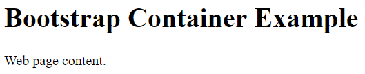
Bootstrap container Example:
<!DOCTYPE html> <html lang="en"> <head> <title>Bootstrap Container Example</title> <meta name="viewport" content="width=device-width, initial-scale=1"> <link rel="stylesheet" href="http://maxcdn.bootstrapcdn.com/bootstrap/3.3.6/css/bootstrap.min.css"> </head> <body> <div class="container"> <h1>Bootstrap Container Example</h1> <p>Web page content.</p> </div> <script src="https://ajax.googleapis.com/ajax/libs/jquery/1.12.0/jquery.min.js"></script> <script src="http://maxcdn.bootstrapcdn.com/bootstrap/3.3.6/js/bootstrap.min.js"></script> </body> </html> |
Output:
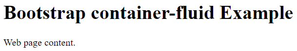
Bootstrap container-fluid Example:
<!DOCTYPE html> <html lang="en"> <head> <title>Bootstrap container-fluid Example</title> <meta name="viewport" content="width=device-width, initial-scale=1"> <link rel="stylesheet" href="http://maxcdn.bootstrapcdn.com/bootstrap/3.3.6/css/bootstrap.min.css"> </head> <body> <div class="container-fluid"> <h1>Bootstrap container-fluid Example</h1> <p>Web page content.</p> </div> <script src="https://ajax.googleapis.com/ajax/libs/jquery/1.12.0/jquery.min.js"></script> <script src="http://maxcdn.bootstrapcdn.com/bootstrap/3.3.6/js/bootstrap.min.js"></script> </body> </html> |
Output: