A progress bar is a graphical control element used to visualize the progression of an extended computer operation. Bootstrap provides several types of progress bars. The .progress class is used with div element to create default progress bar.
Bootstrap 4 Basic Progress Bar Example:
<!DOCTYPE html> <html lang="en"> <head> <title>Bootstrap 4 Basic Progress Bar Example</title> <meta charset="utf-8"> <meta name="viewport" content="width=device-width, initial-scale=1"> <link rel="stylesheet" href="https://maxcdn.bootstrapcdn.com/bootstrap/4.0.0/css/bootstrap.min.css"> <script src="https://ajax.googleapis.com/ajax/libs/jquery/3.3.1/jquery.min.js"></script> <script src="https://cdnjs.cloudflare.com/ajax/libs/popper.js/1.12.9/umd/popper.min.js"></script> <script src="https://maxcdn.bootstrapcdn.com/bootstrap/4.0.0/js/bootstrap.min.js"></script> </head> <body> <div class="container"> <h2>Bootstrap 4 Basic Progress Bar Example</h2> <div class="progress"> <div class="progress-bar" role="progressbar" aria-valuenow="70" aria-valuemin="0" aria-valuemax="100" style="width:65%"> <span class="sr-only">65% Complete</span> </div> </div> </div> </body> </html> |
Output:

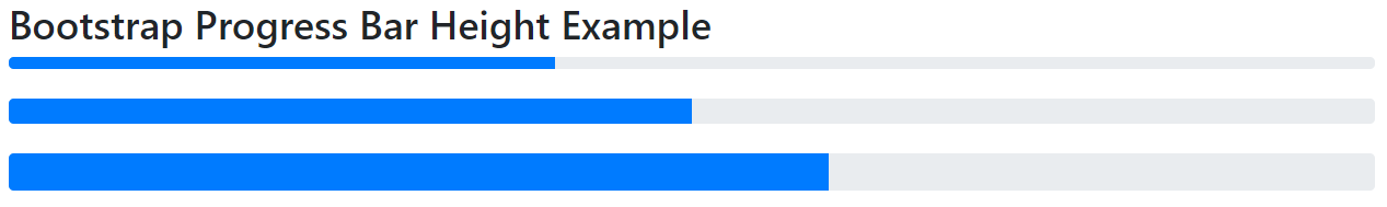
Bootstrap 4 Progress Bar Height Example:
<!DOCTYPE html> <html lang="en"> <head> <title>Bootstrap Progress Bar Height Example</title> <meta charset="utf-8"> <meta name="viewport" content="width=device-width, initial-scale=1"> <link rel="stylesheet" href="https://maxcdn.bootstrapcdn.com/bootstrap/4.0.0/css/bootstrap.min.css"> <script src="https://ajax.googleapis.com/ajax/libs/jquery/3.3.1/jquery.min.js"></script> <script src="https://cdnjs.cloudflare.com/ajax/libs/popper.js/1.12.9/umd/popper.min.js"></script> <script src="https://maxcdn.bootstrapcdn.com/bootstrap/4.0.0/js/bootstrap.min.js"></script> </head> <body> <div class="container"> <h2>Bootstrap Progress Bar Height Example</h2> <div class="progress" style="height:10px"> <div class="progress-bar" style="width:40%;height:10px"></div> </div> <br> <div class="progress" style="height:20px"> <div class="progress-bar" style="width:50%;height:20px"></div> </div> <br> <div class="progress" style="height:30px"> <div class="progress-bar" style="width:60%;height:30px"></div> </div> </div> </body> </html> |
Output:
Bootstrap 4 Progress Bar With Label
We have add text inside the progress bar to show the visible percentage.
Bootstrap 4 Progress Bar With Label Example:
<!DOCTYPE html> <html lang="en"> <head> <title>Bootstrap Progress Bar With Label Example</title> <meta charset="utf-8"> <meta name="viewport" content="width=device-width, initial-scale=1"> <link rel="stylesheet" href="https://maxcdn.bootstrapcdn.com/bootstrap/4.0.0/css/bootstrap.min.css"> <script src="https://ajax.googleapis.com/ajax/libs/jquery/3.3.1/jquery.min.js"></script> <script src="https://cdnjs.cloudflare.com/ajax/libs/popper.js/1.12.9/umd/popper.min.js"></script> <script src="https://maxcdn.bootstrapcdn.com/bootstrap/4.0.0/js/bootstrap.min.js"></script> </head> <body> <div class="container"> <h2>Bootstrap Progress Bar With Label Example</h2> <div class="progress"> <div class="progress-bar" style="width:70%">70%</div> </div> </div> </body> </html> |
Output:

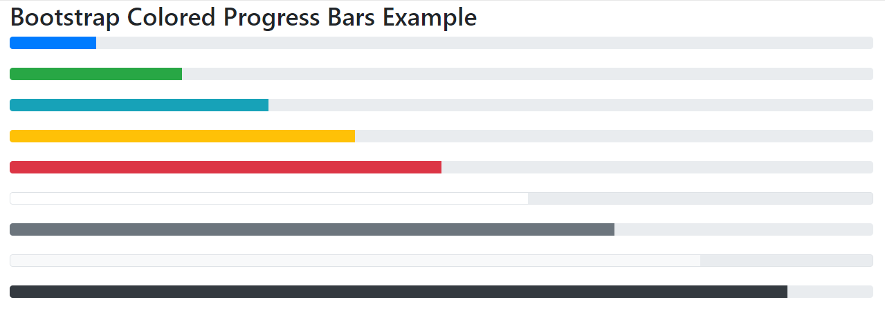
Bootstrap 4 Colored Progress Bars
Bootstrap provides the following contextual classes to provide “meaning through colors”. By default, the progress bar is blue.
• .bg-success
• .bg-info
• .bg-warning
• .bg-danger
• .bg-white
• .bg-secondary
• .bg-light
• .bg-dark
Bootstrap 4 Colored Progress Bars Example:
<!DOCTYPE html> <html lang="en"> <head> <title>Bootstrap Colored Progress Bars Example</title> <meta charset="utf-8"> <meta name="viewport" content="width=device-width, initial-scale=1"> <link rel="stylesheet" href="https://maxcdn.bootstrapcdn.com/bootstrap/4.0.0/css/bootstrap.min.css"> <script src="https://ajax.googleapis.com/ajax/libs/jquery/3.3.1/jquery.min.js"></script> <script src="https://cdnjs.cloudflare.com/ajax/libs/popper.js/1.12.9/umd/popper.min.js"></script> <script src="https://maxcdn.bootstrapcdn.com/bootstrap/4.0.0/js/bootstrap.min.js"></script> </head> <body> <div class="container"> <h2> Bootstrap Colored Progress Bars Example</h2> <div class="progress"> <div class="progress-bar" style="width:10%"></div> </div><br> <div class="progress"> <div class="progress-bar bg-success" style="width:20%"></div> </div><br> <div class="progress"> <div class="progress-bar bg-info" style="width:30%"></div> </div><br> <div class="progress"> <div class="progress-bar bg-warning" style="width:40%"></div> </div><br> <div class="progress"> <div class="progress-bar bg-danger" style="width:50%"></div> </div><br> <div class="progress border"> <div class="progress-bar bg-white" style="width:60%"></div> </div><br> <div class="progress"> <div class="progress-bar bg-secondary" style="width:70%"></div> </div><br> <div class="progress border"> <div class="progress-bar bg-light" style="width:80%"></div> </div><br> <div class="progress"> <div class="progress-bar bg-dark" style="width:90%"></div> </div> </div> </body> </html> |
Output:
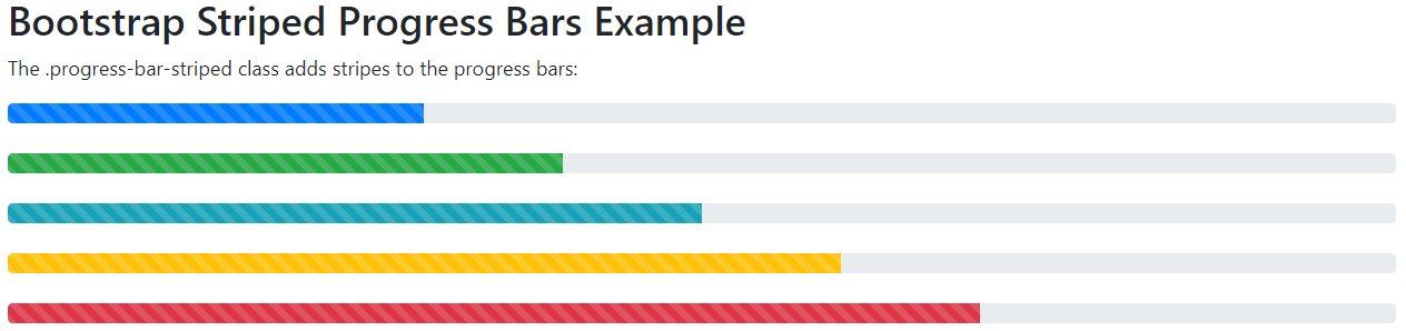
Bootstrap 4 Striped Progress Bars
The .progress-bar-striped class is used to add stripes to the progress bars.
Bootstrap 4 Striped Progress Bars Example:
<!DOCTYPE html> <html lang="en"> <head> <title>Bootstrap Striped Progress Bars Example</title> <meta charset="utf-8"> <meta name="viewport" content="width=device-width, initial-scale=1"> <link rel="stylesheet" href="https://maxcdn.bootstrapcdn.com/bootstrap/4.0.0/css/bootstrap.min.css"> <script src="https://ajax.googleapis.com/ajax/libs/jquery/3.3.1/jquery.min.js"></script> <script src="https://cdnjs.cloudflare.com/ajax/libs/popper.js/1.12.9/umd/popper.min.js"></script> <script src="https://maxcdn.bootstrapcdn.com/bootstrap/4.0.0/js/bootstrap.min.js"></script> </head> <body> <div class="container"> <h2>Bootstrap Striped Progress Bars Example</h2> <p>The .progress-bar-striped class adds stripes to the progress bars:</p> <div class="progress"> <div class="progress-bar progress-bar-striped" style="width:30%"></div> </div> <br> <div class="progress"> <div class="progress-bar bg-success progress-bar-striped" style="width:40%"></div> </div> <br> <div class="progress"> <div class="progress-bar bg-info progress-bar-striped" style="width:50%"></div> </div> <br> <div class="progress"> <div class="progress-bar bg-warning progress-bar-striped" style="width:60%"></div> </div> <br> <div class="progress"> <div class="progress-bar bg-danger progress-bar-striped" style="width:70%"></div> </div> </div> </body> </html> |
Output:
Bootstrap 4 Animated Progress Bars
The .progress-bar-animated class is used to animate the progress bar.
Bootstrap 4 Animated Progress Bars Example:
<!DOCTYPE html> <html lang="en"> <head> <title>Bootstrap Animated Progress Bar Example</title> <meta charset="utf-8"> <meta name="viewport" content="width=device-width, initial-scale=1"> <link rel="stylesheet" href="https://maxcdn.bootstrapcdn.com/bootstrap/4.0.0/css/bootstrap.min.css"> <script src="https://ajax.googleapis.com/ajax/libs/jquery/3.3.1/jquery.min.js"></script> <script src="https://cdnjs.cloudflare.com/ajax/libs/popper.js/1.12.9/umd/popper.min.js"></script> <script src="https://maxcdn.bootstrapcdn.com/bootstrap/4.0.0/js/bootstrap.min.js"></script> </head> <body> <div class="container"> <h2>Bootstrap Animated Progress Bar Example</h2> <div class="progress"> <div class="progress-bar progress-bar-striped progress-bar-animated" style="width:40%"></div> </div> </div> </body> </html> |
Output:

Bootstrap 4 Stacked Progress Bars
To create a stacked progress bar place multiple bars into the same div class=”progress”.
Bootstrap 4 Stacked Progress Bars Example:
<!DOCTYPE html> <html lang="en"> <head> <title>Bootstrap Stacked Progress Bars Example</title> <meta charset="utf-8"> <meta name="viewport" content="width=device-width, initial-scale=1"> <link rel="stylesheet" href="https://maxcdn.bootstrapcdn.com/bootstrap/3.3.7/css/bootstrap.min.css"> <script src="https://ajax.googleapis.com/ajax/libs/jquery/3.3.1/jquery.min.js"></script> <script src="https://maxcdn.bootstrapcdn.com/bootstrap/3.3.7/js/bootstrap.min.js"></script> </head> <body> <div class="container"> <h2>Bootstrap Stacked Progress Bars Example</h2> <div class="progress"> <div class="progress-bar progress-bar-success" role="progressbar" style="width:40%"> Alerts </div> <div class="progress-bar progress-bar-warning" role="progressbar" style="width:10%"> Updates </div> <div class="progress-bar progress-bar-danger" role="progressbar" style="width:20%"> Worklist </div> </div> </div> </body> </html> |
Output:
