Grid:
Grid refers to an array of squares or rectangles.
According to Wikipedia:
“In graphic design, a grid is a structure (usually two-dimensional) made up of a series of intersecting straight (vertical, horizontal) lines used to structure the content. It is widely used to design layout and content structure in print design. In web design, it is a very effective method to create a consistent layout rapidly and effectively using HTML and CSS.”
Bootstrap 4 Grid System:
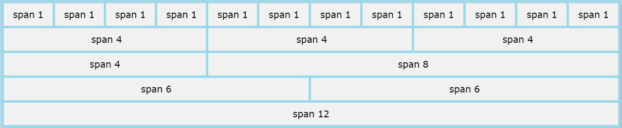
Bootstrap Grid System provides the facility to create advanced layouts using rows and columns. It allows up to 12 columns across the page i.e. number of columns can be up to 12 or fewer. We can use all 12 columns individually or can groups the columns together to create wider columns. Bootstrap Grid System is responsive and the columns will re-arrange automatically depending on the size of screen.
Bootstrap 4 Grid Classes:
Bootstrap 4 Grid System have following five classes which can be combined to create more dynamic and flexible layouts.
• .col- (for extra small devices): screen width less than 576px.
• .col-sm- (for small devices): screen width equal to or greater than 576px.
• .col-md- (for medium devices): screen width equal to or greater than 768px.
• .col-lg- (for large devices): screen width equal to or greater than 992px
• .col-xl- (for xlarge devices): screen width equal to or greater than 1200px.
Note: Bootstrap 4 uses a 5 tier grid system while Bootstrap 3 uses a 4 tier grid system.
Basic Structure of a Bootstrap 4 Grid:
<!-- Control the column width manually and how they should appear on different devices --> <div class="row"> <div class="col-*-*"></div> <div class="col-*-*"></div> </div> <div class="row"> <div class="col-*-*"></div> <div class="col-*-*"></div> <div class="col-*-*"></div> </div> <!-- Or let Bootstrap automatically handle the layout --> <div class="row"> <div class="col"></div> <div class="col"></div> <div class="col"></div> </div> |
Steps to create Bootstrap grid:
1. Create a row.
<div class="row"> |
2. Add the required number of columns (tags with appropriate .col-*-* classes).
Note: In .col-*-* , the first star (*) represents the responsiveness: sm, md, lg or xl while the second star represents a number (number of columns) which should not be greater than 12 for each row. Grids should be placed within a container either .container or the .container-fluid class.
In second example Bootstrap automatically handle the layout and will create equal width columns.
Bootstrap 4 equal columns example:
<!DOCTYPE html> <html lang="en"> <head> <title> Bootstrap 4 equal columns example.</title> <meta charset="utf-8"> <meta name="viewport" content="width=device-width, initial-scale=1"> <link rel="stylesheet" href="https://maxcdn.bootstrapcdn.com/bootstrap/4.0.0/css/bootstrap.min.css"> <script src="https://ajax.googleapis.com/ajax/libs/jquery/3.3.1/jquery.min.js"></script> <script src="https://cdnjs.cloudflare.com/ajax/libs/popper.js/1.12.9/umd/popper.min.js"></script> <script src="https://maxcdn.bootstrapcdn.com/bootstrap/4.0.0/js/bootstrap.min.js"></script> </head> <body> <div class="container-fluid"> <h2> Bootstrap 4 equal columns example.</h2> <div class="row"> <div class="col" style="background-color:lavender;">WorkList</div> <div class="col" style="background-color: lavenderblush;">Alerts</div> <div class="col" style="background-color:lavender;">Updates</div> </div> </div> </body> </html> |
Output:

Bootstrap 4 responsive equal columns example:
<!DOCTYPE html> <html lang="en"> <head> <title> Bootstrap 4 responsive columns example.</title> <meta charset="utf-8"> <meta name="viewport" content="width=device-width, initial-scale=1"> <link rel="stylesheet" href="https://maxcdn.bootstrapcdn.com/bootstrap/4.0.0/css/bootstrap.min.css"> <script src="https://ajax.googleapis.com/ajax/libs/jquery/3.3.1/jquery.min.js"></script> <script src="https://cdnjs.cloudflare.com/ajax/libs/popper.js/1.12.9/umd/popper.min.js"></script> <script src="https://maxcdn.bootstrapcdn.com/bootstrap/4.0.0/js/bootstrap.min.js"></script> </head> <body> <div class="container-fluid"> <h2> Bootstrap 4 responsive columns example.</h2> <div class="row"> <div class="col-sm-3" style="background-color:lavender;">WorkList</div> <div class="col-sm-3" style="background-color:lavenderblush;">Alerts</div> <div class="col-sm-3" style="background-color:lavender;">Updates</div> <div class="col-sm-3" style="background-color:lavenderblush;">Info</div> </div> </div> </body> </html> |
Output:

Bootstrap 4 responsive unequal columns example:
<!DOCTYPE html> <html lang="en"> <head> <title>Bootstrap Example</title> <meta charset="utf-8"> <meta name="viewport" content="width=device-width, initial-scale=1"> <link rel="stylesheet" href="https://maxcdn.bootstrapcdn.com/bootstrap/3.3.7/css/bootstrap.min.css"> <script src="https://ajax.googleapis.com/ajax/libs/jquery/3.3.1/jquery.min.js"></script> <script src="https://maxcdn.bootstrapcdn.com/bootstrap/3.3.7/js/bootstrap.min.js"></script> </head> <body> <div class="container-fluid"> <h2>Bootstrap 4 responsive unequal columns example</h2> <div class="row"> <div class="col-sm-4" style="background-color:lavender;">WorkList</div> <div class="col-sm-8" style="background-color:lavenderblush;">Updates</div> </div> </div> </body> </html> |
Output:
