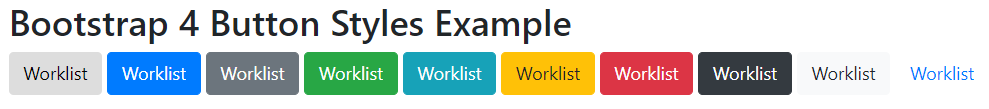
Bootstrap provides the following classes to achieve different styles of buttons.
• .btn
• .btn-default
• .btn-primary
• .btn-success
• .btn-info
• .btn-warning
• .btn-danger
• .btn-link
• .btn-secondary
• .btn-dark
• .btn-light
Bootstrap 4 Buttons Style Example:
<!DOCTYPE html> <html lang="en"> <head> <title>Bootstrap 4 Buttons Style Example</title> <meta charset="utf-8"> <meta name="viewport" content="width=device-width, initial-scale=1"> <link rel="stylesheet" href="https://maxcdn.bootstrapcdn.com/bootstrap/4.0.0/css/bootstrap.min.css"> <script src="https://ajax.googleapis.com/ajax/libs/jquery/3.3.1/jquery.min.js"></script> <script src="https://cdnjs.cloudflare.com/ajax/libs/popper.js/1.12.9/umd/popper.min.js"></script> <script src="https://maxcdn.bootstrapcdn.com/bootstrap/4.0.0/js/bootstrap.min.js"></script> </head> <body> <div class="container"> <h2>Bootstrap 4 Button Styles Example</h2> <button type="button" class="btn">Worklist</button> <button type="button" class="btn btn-primary">Worklist</button> <button type="button" class="btn btn-secondary">Worklist</button> <button type="button" class="btn btn-success">Worklist</button> <button type="button" class="btn btn-info">Worklist</button> <button type="button" class="btn btn-warning">Worklist</button> <button type="button" class="btn btn-danger">Worklist</button> <button type="button" class="btn btn-dark">Worklist</button> <button type="button" class="btn btn-light">Worklist</button> <button type="button" class="btn btn-link">Worklist</button> </div> </body> </html> |
Output:
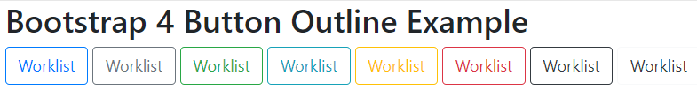
Bootstrap Buttons Outline
Bootstrap provides the following classes to add outline or border to the buttons.
• .btn-outline-primary
• .btn-outline-secondary
• .btn-outline-success
• .btn-outline-info
• .btn-outline-warning
• .btn-outline-danger
• .btn-outline-dark
• .btn-outline-light
Bootstrap Buttons Outline Example:
<!DOCTYPE html> <html lang="en"> <head> <title>Bootstrap 4 Button Outline Example</title> <meta charset="utf-8"> <meta name="viewport" content="width=device-width, initial-scale=1"> <link rel="stylesheet" href="https://maxcdn.bootstrapcdn.com/bootstrap/4.0.0/css/bootstrap.min.css"> <script src="https://ajax.googleapis.com/ajax/libs/jquery/3.3.1/jquery.min.js"></script> <script src="https://cdnjs.cloudflare.com/ajax/libs/popper.js/1.12.9/umd/popper.min.js"></script> <script src="https://maxcdn.bootstrapcdn.com/bootstrap/4.0.0/js/bootstrap.min.js"></script> </head> <body> <div class="container"> <h2>Bootstrap 4 Button Outline Example</h2> <button type="button" class="btn btn-outline-primary">Worklist</button> <button type="button" class="btn btn-outline-secondary">Worklist</button> <button type="button" class="btn btn-outline-success">Worklist</button> <button type="button" class="btn btn-outline-info">Worklist</button> <button type="button" class="btn btn-outline-warning">Worklist</button> <button type="button" class="btn btn-outline-danger">Worklist</button> <button type="button" class="btn btn-outline-dark">Worklist</button> <button type="button" class="btn btn-outline-light text-dark">Worklist</button> </div> </body> </html> |
Output:
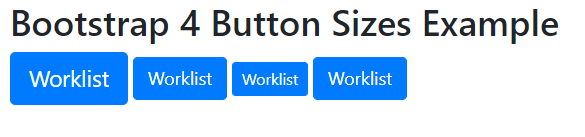
Bootstrap 4 Buttons Size
Bootstrap provides the following classes to define the different button sizes.
• .btn-lg
• .btn-md
• .btn-sm
• .btn-xs
Bootstrap 4 Buttons Size Example:
<!DOCTYPE html> <html lang="en"> <head> <title>Bootstrap 4 Button Sizes Example</title> <meta charset="utf-8"> <meta name="viewport" content="width=device-width, initial-scale=1"> <link rel="stylesheet" href="https://maxcdn.bootstrapcdn.com/bootstrap/4.0.0/css/bootstrap.min.css"> <script src="https://ajax.googleapis.com/ajax/libs/jquery/3.3.1/jquery.min.js"></script> <script src="https://cdnjs.cloudflare.com/ajax/libs/popper.js/1.12.9/umd/popper.min.js"></script> <script src="https://maxcdn.bootstrapcdn.com/bootstrap/4.0.0/js/bootstrap.min.js"></script> </head> <body> <div class="container"> <h2>Bootstrap 4 Button Sizes Example</h2> <button type="button" class="btn btn-primary btn-lg">Worklist</button> <button type="button" class="btn btn-primary btn-md">Worklist</button> <button type="button" class="btn btn-primary btn-sm">Worklist</button> <button type="button" class="btn btn-primary btn-xs">Worklist</button> </div> </body> </html> |
Output:
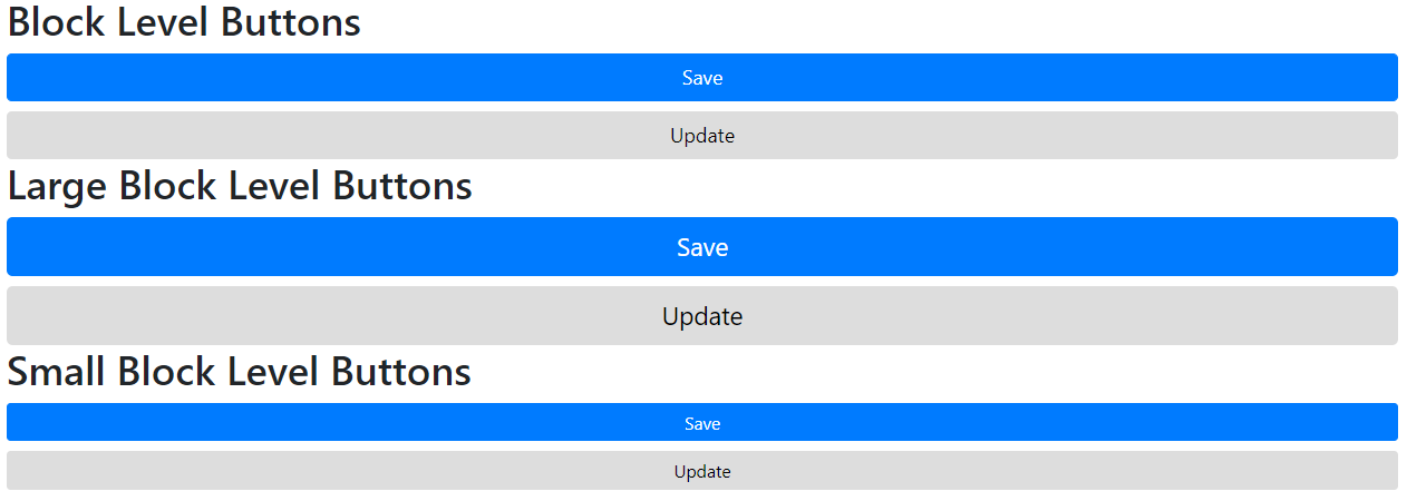
Bootstrap 4 Block Level Buttons
The .btn-block class is used to create a block level button. A block level button spans the entire width of the parent element.
Bootstrap 4 Block Level Buttons Example:
<!DOCTYPE html> <html lang="en"> <head> <title>Bootstrap 4 Block Level Buttons Example</title> <meta charset="utf-8"> <meta name="viewport" content="width=device-width, initial-scale=1"> <link rel="stylesheet" href="https://maxcdn.bootstrapcdn.com/bootstrap/4.0.0/css/bootstrap.min.css"> <script src="https://ajax.googleapis.com/ajax/libs/jquery/3.3.1/jquery.min.js"></script> <script src="https://cdnjs.cloudflare.com/ajax/libs/popper.js/1.12.9/umd/popper.min.js"></script> <script src="https://maxcdn.bootstrapcdn.com/bootstrap/4.0.0/js/bootstrap.min.js"></script> </head> <body> <div class="container"> <h2>Block Level Buttons</h2> <button type="button" class="btn btn-primary btn-block">Save</button> <button type="button" class="btn btn-default btn-block">Update</button> <h2>Large Block Level Buttons</h2> <button type="button" class="btn btn-primary btn-lg btn-block">Save</button> <button type="button" class="btn btn-default btn-lg btn-block">Update</button> <h2>Small Block Level Buttons</h2> <button type="button" class="btn btn-primary btn-sm btn-block">Save</button> <button type="button" class="btn btn-default btn-sm btn-block">Update</button> </div> </body> </html> |
Output:
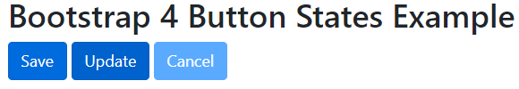
Bootstrap 4 Button States
Bootstrap provides the following classes to set a button as active or disabled.
.active: makes a button clickable.
.disabled: makes a button unclickable.
Bootstrap 4 Buttons States Example:
<!DOCTYPE html> <html lang="en"> <head> <title>Bootstrap 4 Button States Example</title> <meta charset="utf-8"> <meta name="viewport" content="width=device-width, initial-scale=1"> <link rel="stylesheet" href="https://maxcdn.bootstrapcdn.com/bootstrap/4.0.0/css/bootstrap.min.css"> <script src="https://ajax.googleapis.com/ajax/libs/jquery/3.3.1/jquery.min.js"></script> <script src="https://cdnjs.cloudflare.com/ajax/libs/popper.js/1.12.9/umd/popper.min.js"></script> <script src="https://maxcdn.bootstrapcdn.com/bootstrap/4.0.0/js/bootstrap.min.js"></script> </head> <body> <div class="container"> <h2>Bootstrap 4 Button States Example</h2> <button type="button" class="btn btn-primary">Save</button> <button type="button" class="btn btn-primary active">Update</button> <button type="button" class="btn btn-primary disabled">Cancel</button> </div> </body> </html> |
Output: