Add the HTML5 doctype:
Bootstrap uses HTML elements and CSS properties that require the HTML5 doctype. So we have to include the HTML5 doctype at the beginning of the page, along with the lang attribute and the correct character set.
<!DOCTYPE html> <html lang="en"> <head> <meta charset="utf-8"> </head> </html> |
Bootstrap 3 is mobile-first:
As we discussed in previous tutorial, Bootstrap 3 provides mobile-first styles as a part of the core framework. So we have to add the following tag inside the
element for proper rendering and touch zooming.<meta name="viewport" content="width=device-width, initial-scale=1"> |
Where:
width=device-width: It is used to set the width of the page to follow the screen-width of the device. Screen-width will vary depending on the device.
initial-scale=1: It is used to set the initial zoom level when the page is first loaded by the browser.
Containers:
Bootstrap containers are used to wrap the site contents.
Bootstrap container classes:
.container class: It provides a responsive fixed width container.
.container-fluid class: It provides a full width container, spanning the entire width of the view port.
Note: Bootstrap Containers are not nestable i.e. we cannot put a container inside another container.
Bootstrap Example:
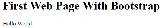
<!DOCTYPE html> <html lang="en"> <head> <title>Bootstrap Example</title> <meta name="viewport" content="width=device-width, initial-scale=1"> <link rel="stylesheet" href="http://maxcdn.bootstrapcdn.com/bootstrap/3.3.6/css/bootstrap.min.css"> </head> <body> <div class="container"> <h1>First Web Page With Bootstrap</h1> <p>Hello World.</p> </div> <script src="https://ajax.googleapis.com/ajax/libs/jquery/1.12.0/jquery.min.js"></script> <script src="http://maxcdn.bootstrapcdn.com/bootstrap/3.3.6/js/bootstrap.min.js"></script> </body> </html> |
Output: