Alert refers to a state of being watchful.
Bootstrap provides the .alert class to provide an easy way to create predefined alert messages. The .alert class will be followed by one of the four contextual classes .alert-success, .alert-info, .alert-warning or .alert-danger.
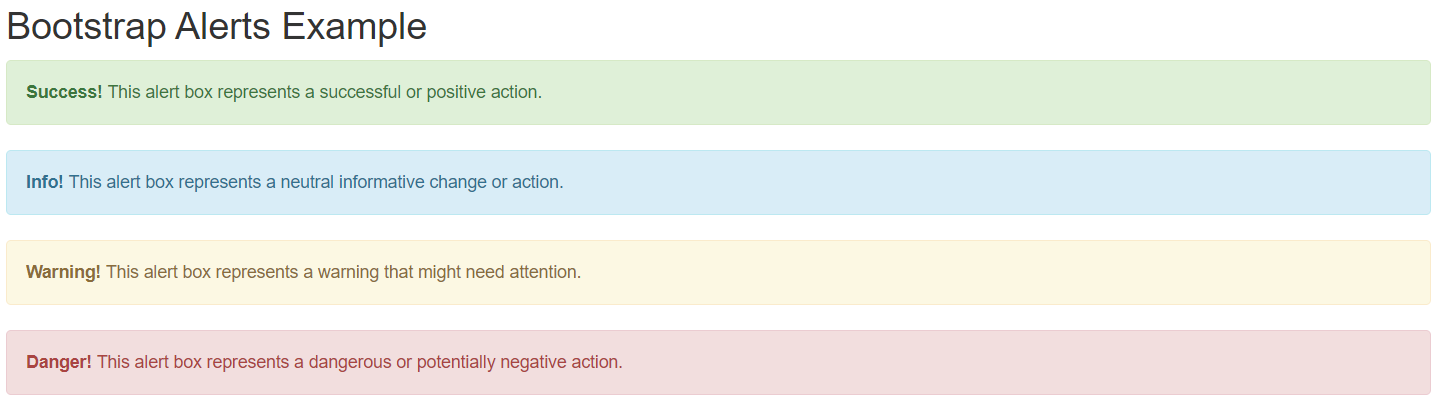
Bootstrap Alert Example:
<!DOCTYPE html> <html lang="en"> <head> <title>Bootstrap Alerts Example</title> <meta charset="utf-8"> <meta name="viewport" content="width=device-width, initial-scale=1"> <link rel="stylesheet" href="https://maxcdn.bootstrapcdn.com/bootstrap/3.3.7/css/bootstrap.min.css"> <script src="https://ajax.googleapis.com/ajax/libs/jquery/3.3.1/jquery.min.js"></script> <script src="https://maxcdn.bootstrapcdn.com/bootstrap/3.3.7/js/bootstrap.min.js"></script> </head> <body> <div class="container"> <h2>Bootstrap Alerts Example</h2> <div class="alert alert-success"> <strong>Success!</strong> This alert box represents a successful or positive action. </div> <div class="alert alert-info"> <strong>Info!</strong> This alert box represents a neutral informative change or action. </div> <div class="alert alert-warning"> <strong>Warning!</strong> This alert box represents a warning that might need attention. </div> <div class="alert alert-danger"> <strong>Danger!</strong> This alert box represents a dangerous or potentially negative action. </div> </div> </body> </html> |
Output:
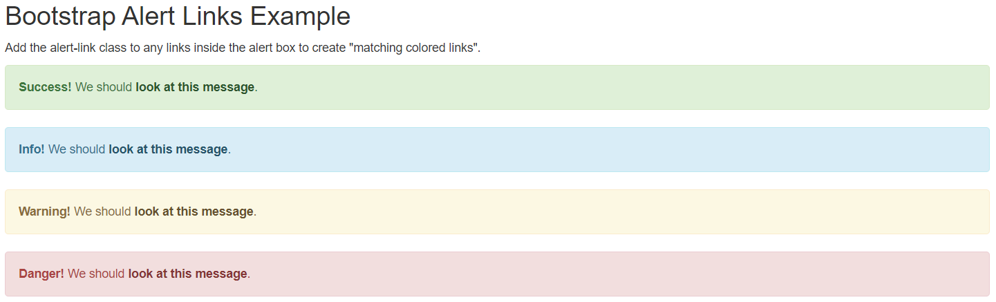
Bootstrap Alert Link
We have to add the alert-link class to any links inside the alert box to create “matching colored links”.
Bootstrap Alert Link Example:
<!DOCTYPE html> <html lang="en"> <head> <title>Bootstrap Alert Links Example</title> <meta charset="utf-8"> <meta name="viewport" content="width=device-width, initial-scale=1"> <link rel="stylesheet" href="https://maxcdn.bootstrapcdn.com/bootstrap/3.3.7/css/bootstrap.min.css"> <script src="https://ajax.googleapis.com/ajax/libs/jquery/3.3.1/jquery.min.js"></script> <script src="https://maxcdn.bootstrapcdn.com/bootstrap/3.3.7/js/bootstrap.min.js"></script> </head> <body> <div class="container"> <h2>Bootstrap Alert Links Example</h2> <p>Add the alert-link class to any links inside the alert box to create "matching colored links".</p> <div class="alert alert-success"> <strong>Success!</strong> We should <a href="#" class="alert-link">look at this message</a>. </div> <div class="alert alert-info"> <strong>Info!</strong> We should <a href="#" class="alert-link">look at this message</a>. </div> <div class="alert alert-warning"> <strong>Warning!</strong> We should <a href="#" class="alert-link">look at this message</a>. </div> <div class="alert alert-danger"> <strong>Danger!</strong> We should <a href="#" class="alert-link">look at this message</a>. </div> </div> </body> </html> |
Output:
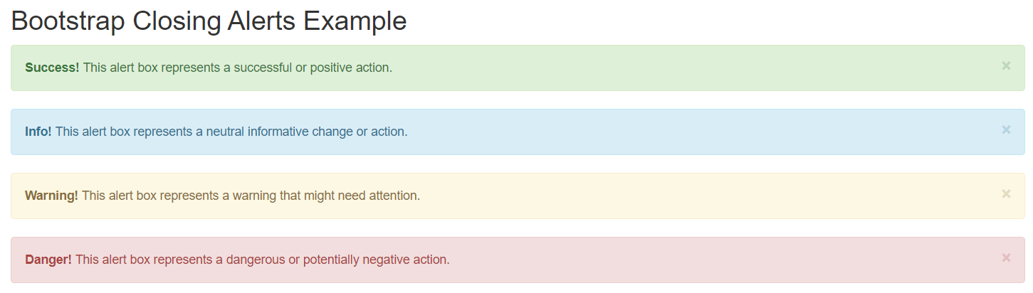
Bootstrap Closing Alerts
To close the alert message we have to add an .alert-dismissable class to the alert container. Then add class=”close” and data-dismiss=”alert” to a link or a button element. When you click on the close sign, the alert box will be closed.
Bootstrap Closing Alerts Example:
<!DOCTYPE html> <html lang="en"> <head> <title>Bootstrap Closing Alerts Example</title> <meta charset="utf-8"> <meta name="viewport" content="width=device-width, initial-scale=1"> <link rel="stylesheet" href="https://maxcdn.bootstrapcdn.com/bootstrap/3.3.7/css/bootstrap.min.css"> <script src="https://ajax.googleapis.com/ajax/libs/jquery/3.3.1/jquery.min.js"></script> <script src="https://maxcdn.bootstrapcdn.com/bootstrap/3.3.7/js/bootstrap.min.js"></script> </head> <body> <div class="container"> <h2>Bootstrap Closing Alerts Example</h2> <div class="alert alert-success alert-dismissable"> <a href="#" class="close" data-dismiss="alert" aria-label="close">×</a> <strong>Success!</strong> This alert box represents a successful or positive action. </div> <div class="alert alert-info alert-dismissable"> <a href="#" class="close" data-dismiss="alert" aria-label="close">×</a> <strong>Info!</strong> This alert box represents a neutral informative change or action. </div> <div class="alert alert-warning alert-dismissable"> <a href="#" class="close" data-dismiss="alert" aria-label="close">×</a> <strong>Warning!</strong> This alert box represents a warning that might need attention. </div> <div class="alert alert-danger alert-dismissable"> <a href="#" class="close" data-dismiss="alert" aria-label="close">×</a> <strong>Danger!</strong> This alert box represents a dangerous or potentially negative action. </div> </div> </body> </html> |
Output:
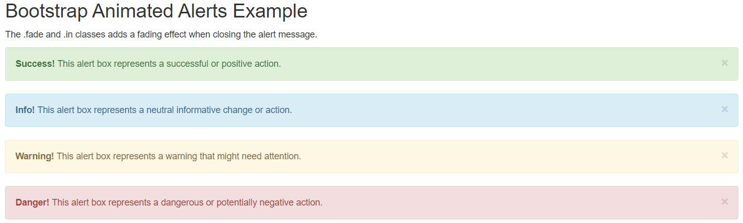
Bootstrap Animated Alerts
Bootstrap provides the .fade and .in classes to add a fading effect when closing the alert message.
Bootstrap Animated Alerts Example:
<!DOCTYPE html> <html lang="en"> <head> <title>Bootstrap Animated Alerts Example</title> <meta charset="utf-8"> <meta name="viewport" content="width=device-width, initial-scale=1"> <link rel="stylesheet" href="https://maxcdn.bootstrapcdn.com/bootstrap/3.3.7/css/bootstrap.min.css"> <script src="https://ajax.googleapis.com/ajax/libs/jquery/3.3.1/jquery.min.js"></script> <script src="https://maxcdn.bootstrapcdn.com/bootstrap/3.3.7/js/bootstrap.min.js"></script> </head> <body> <div class="container"> <h2>Bootstrap Animated Alerts Example</h2> <p>The .fade and .in classes adds a fading effect when closing the alert message.</p> <div class="alert alert-success alert-dismissable fade in"> <a href="#" class="close" data-dismiss="alert" aria-label="close">×</a> <strong>Success!</strong> This alert box represents a successful or positive action. </div> <div class="alert alert-info alert-dismissable fade in"> <a href="#" class="close" data-dismiss="alert" aria-label="close">×</a> <strong>Info!</strong> This alert box represents a neutral informative change or action. </div> <div class="alert alert-warning alert-dismissable fade in"> <a href="#" class="close" data-dismiss="alert" aria-label="close">×</a> <strong>Warning!</strong> This alert box represents a warning that might need attention. </div> <div class="alert alert-danger alert-dismissable fade in"> <a href="#" class="close" data-dismiss="alert" aria-label="close">×</a> <strong>Danger!</strong> This alert box represents a dangerous or potentially negative action. </div> </div> </body> </html> |
Output: